NETTL :ONE RESPONSIVE WEBSITES
A mobile, tablet friendly and responsive website, all in one.
Your website…
is your shop window to the world. It’s an essential element of your brand identity and provides a vital opportunity to create the right impression before customers have even spoken to you. Thousands of potential customers are searching online for local, small businesses and without a website, business will lose out.
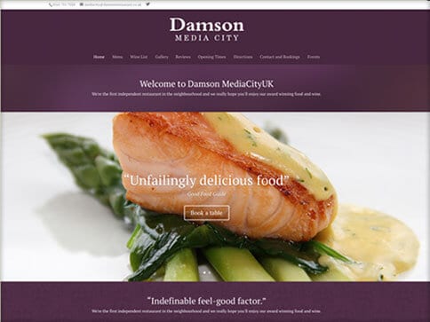
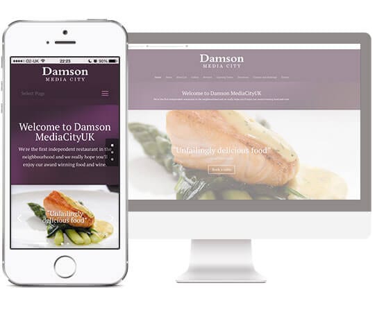
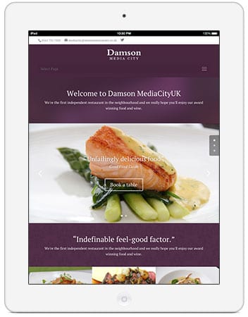
Responsive
Our popular Nettl :one websites are ‘responsive’ – their ‘liquid layout’ adapts and reflows to suit any device. With more than half of visitors now browsing on their phone, a responsive mobile-friendly website will maximize the chances of engagement from potential clients.
We specialize in building creative, beautiful, functional – but most importantly – responsive websites to take your business to the next level. We’re ready to build your next website and we’re here to help keep it fresh so it can continue performing.
EASY TO EDIT
Your Nettl :one website has a built-in content management system. Easily edit text and update images yourself, at no cost, as often as you like.
SEARCH ENGINE READY
Every Nettl :one site is search-engine-ready as standard. Moving up search engine rankings needs consistency, skill and effort. Talk to us about the options.
BUILT TO SCALE
Nettl :one is built on strong foundations. Our modular approach means we can scale your site and add functionality when you’re ready. You don’t need to do everything at the start, so as your business grows, your site can grow with you.
See Nettl :connect and Nettl :commerce.
Every Nettl :one responsive website will be deployed into our cloud platform powered by AWS. This uses the same proven infrastructure that runs famous names like Netflix, Pinterest, Expedia and Amazon.
Ask about our hosting packages.
Let’s get started with your FREE consultation!